Interior Paint Colors and Finishes for High-Desert Light
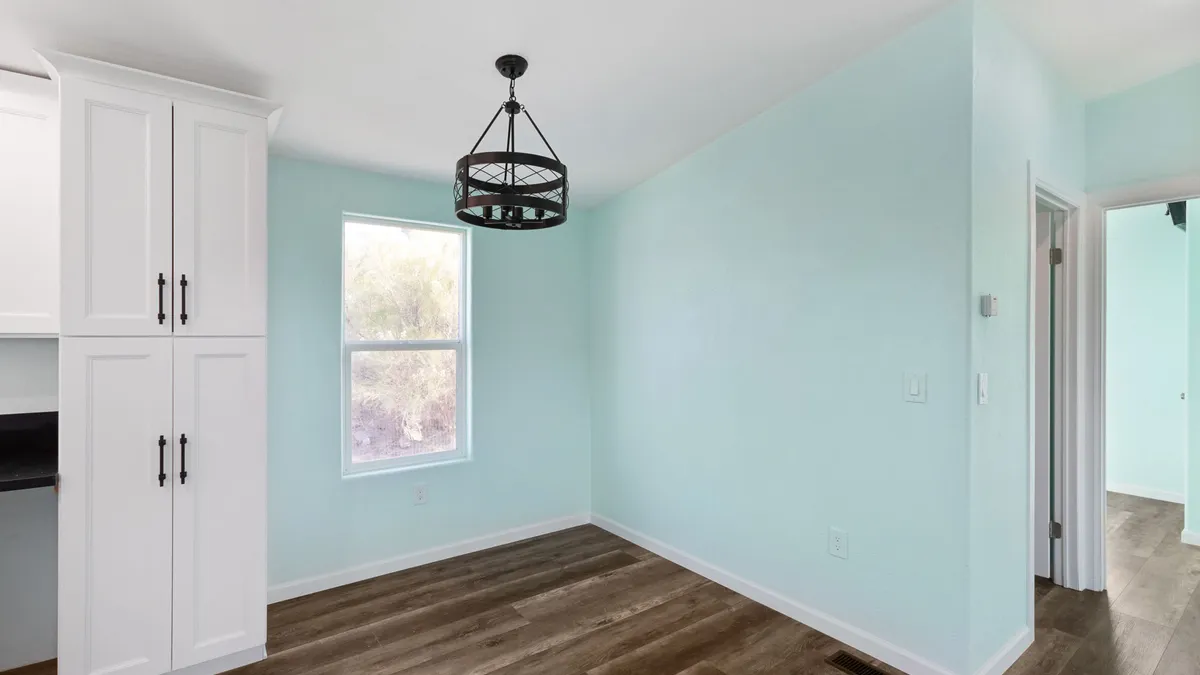
Paint colors that look perfect on a store chip can turn out completely different once they are on the wall in a Prescott home. The high-desert light up here is bright, clear, and often unforgiving, and it changes everything about how a shade reads from morning to evening. Choosing the right color and the right finish is less about following trends and more about understanding the light your home actually gets.
Why high-desert light changes everything
At roughly a mile of elevation, the Prescott area gets intense, direct sunlight with very little haze to soften it. That light is strong, slightly cool at midday, and it pours through windows with real force. The result is that colors look lighter, brighter, and often more saturated indoors than they would at lower elevations or in cloudier climates.
Thin, dry air also means sharp contrast between sunlit and shaded areas of the same room. A color can look crisp and clean near a window and noticeably deeper on the opposite wall. Planning around that range, rather than fighting it, is the key to a result you will still love a year later.
How strong natural light shifts the way colors read
Bright light washes out pale colors and can make a soft gray or greige look almost white by midday. Deep and mid-tone colors tend to hold their character better, but they also show every shift in the sun as the day moves.
Keep a few patterns in mind:
- Whites and near-whites can look stark or glarey in full southern sun.
- Pale colors often need a touch more depth here than they would elsewhere.
- Saturated colors read more vivid, so a shade that felt safe on the chip can feel bold on the wall.
- North-facing rooms stay cooler and more even, while south and west rooms swing a lot through the day.
Warm versus cool undertones
Every color carries an undertone, and undertones are where high-desert light tends to surprise people. Our clear, slightly cool daylight can push grays toward blue, make some whites look icy, and flatten warm beiges into something dull.
Leaning warm
Warm undertones, soft cream, gentle tan, muted terracotta, and warmer whites, generally feel grounded and comfortable against our landscape of granite, pine, and red rock. They counterbalance the cool cast of midday light and keep rooms from feeling cold.
Leaning cool
Cool undertones can work beautifully, but they need care. A blue-gray or green-gray can look serene in a shaded room and turn flat or chilly in a bright one. If you love cooler tones, test them specifically in the rooms that get the most direct sun.
Testing large samples on different walls
This is the single most important step, and the one most often skipped. A small chip held near a window tells you almost nothing about how a color will behave across a whole room over a full day.
Here is a simple approach that works well in Prescott homes:
- Paint sample boards or large patches, at least two feet by two feet.
- Place samples on several walls, including one in direct sun and one in shade.
- Check them in early morning, midday, and evening, and again under your lamps at night.
- Look at the color next to your flooring, trim, and any fixed finishes like stone or tile.
Living with the samples for a few days removes the guesswork. A color that looks great at 8 a.m. and harsh at 4 p.m. is telling you something important before you commit to the whole house.
Choosing sheen by room for durability and washability
Color gets all the attention, but sheen quietly decides how a paint job holds up and how easy it is to clean. Higher sheens are more durable and washable, while flatter finishes hide wall imperfections and glare. In our bright light, very glossy walls can throw noticeable shine, so the goal is balance.
A practical room-by-room guide
- Ceilings: flat, to reduce glare and hide minor texture.
- Bedrooms and formal living areas: matte or eggshell for a soft look with light scrubbability.
- Hallways, family rooms, and kids’ spaces: eggshell or satin, which wipe down more easily.
- Kitchens and bathrooms: satin, for moisture resistance and regular cleaning.
- Trim, doors, and cabinets: semi-gloss, which handles scuffs and cleans up well.
Matching sheen to how a room is used
Think about traffic and hands. A busy hallway with kids, pets, and gear coming through the door needs a finish you can clean without burnishing the surface. A quiet guest room can take a flatter, more forgiving finish. Matching sheen to real life keeps walls looking fresh far longer between repaints.
Handling trim and ceilings
Trim and ceilings frame everything, and in strong light they carry real weight. A trim white that is too bright can glare against softer walls, while a trim that is too warm can muddy a clean color scheme. The safest path is choosing wall color and trim color together, viewed side by side, rather than picking a default white out of habit.
Ceilings deserve the same thought. A flat ceiling white keeps the eye from catching glare overhead, and pulling a hint of the wall color into a ceiling can make a bright room feel calmer. In rooms with a lot of reflected sun, a slightly softer ceiling white often feels better than a stark one.
Putting it all together
Good interior paint in the high desert comes down to three habits: respect the light, test large samples where they will actually live, and let each room’s use guide the sheen. Get those right and your colors will look intentional in every part of the day, not just the moment you chose them.
At Vets 1st of Arizona, we are a veteran-focused general contractor that hires and empowers veterans, and we help homeowners across Prescott, Prescott Valley, Sedona, Cottonwood, Mayer, and Flagstaff get interior paint results that hold up to our bright northern Arizona light. We are a licensed KB-1 Dual Building Contractor, ROC #359130. Call us at (928) 776-3020 for a free phone quote, or schedule a $75 on-site estimate that is credited toward your project when you move forward with the work.